Pantone colour trends for London Fashion Week Spring/Summer ‘23 showcase bright pink, sky blue and soothing green.
Rebecca Snowden, Interior Style Advisor at Furniture And Choice (FurnitureChoice.co.uk), shares 4 ways to style these fashionable colours in your home.
1. Get playful with Pink Cosmos

Pantone’s Spring/Summer 2023 palette for fashion takes a fearless approach to colours, mixing bright hues for a burst of style and expression. “The key to making a bright outfit chic and modern comes down to contrast and accessories,” says Rebecca. “And in the home, the same rules apply.” Introduce a vibrant pink to the bedroom with a feature wall in Pantone 16-2122 Pink Cosmos. Then layer pops of pastels through soft furnishings, artwork and accents. Add cushions and throws in Pantone 14-4122 Airy Blue and Pantone 14-1140 Iced Mango for playful contrast. Balance this vibrant mix of colours with a grey fabric bed, crisp white sheets and clean, minimal accessories.
2. Go light and tonal with Airy Blue

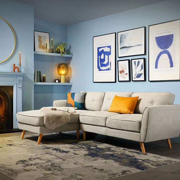
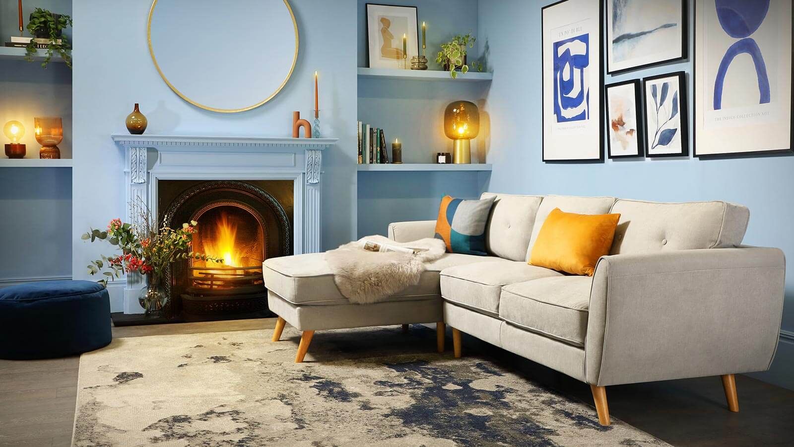
“Style a tonal look at home the same way you’d style a monochrome outfit,” says Rebecca. “Mix light and dark shades of a single colour to create a chic, modern effect that stands out without being overpowering.” Start with Pantone 14-4122 Airy Blue on the walls and work in pops of Pantone 18-4245 Electric Blue Lemonade cushions and artwork to energise the space. Add finishing touches with small accessories like vases and pottery in Pantone 14-1140 Iced Mango and Pantone 16-1544 Persimmon to punch up the contrast even more. Keep the look clean and contemporary with a light grey Scandi inspired sofa.
3. Add warmth with Mocha Mousse

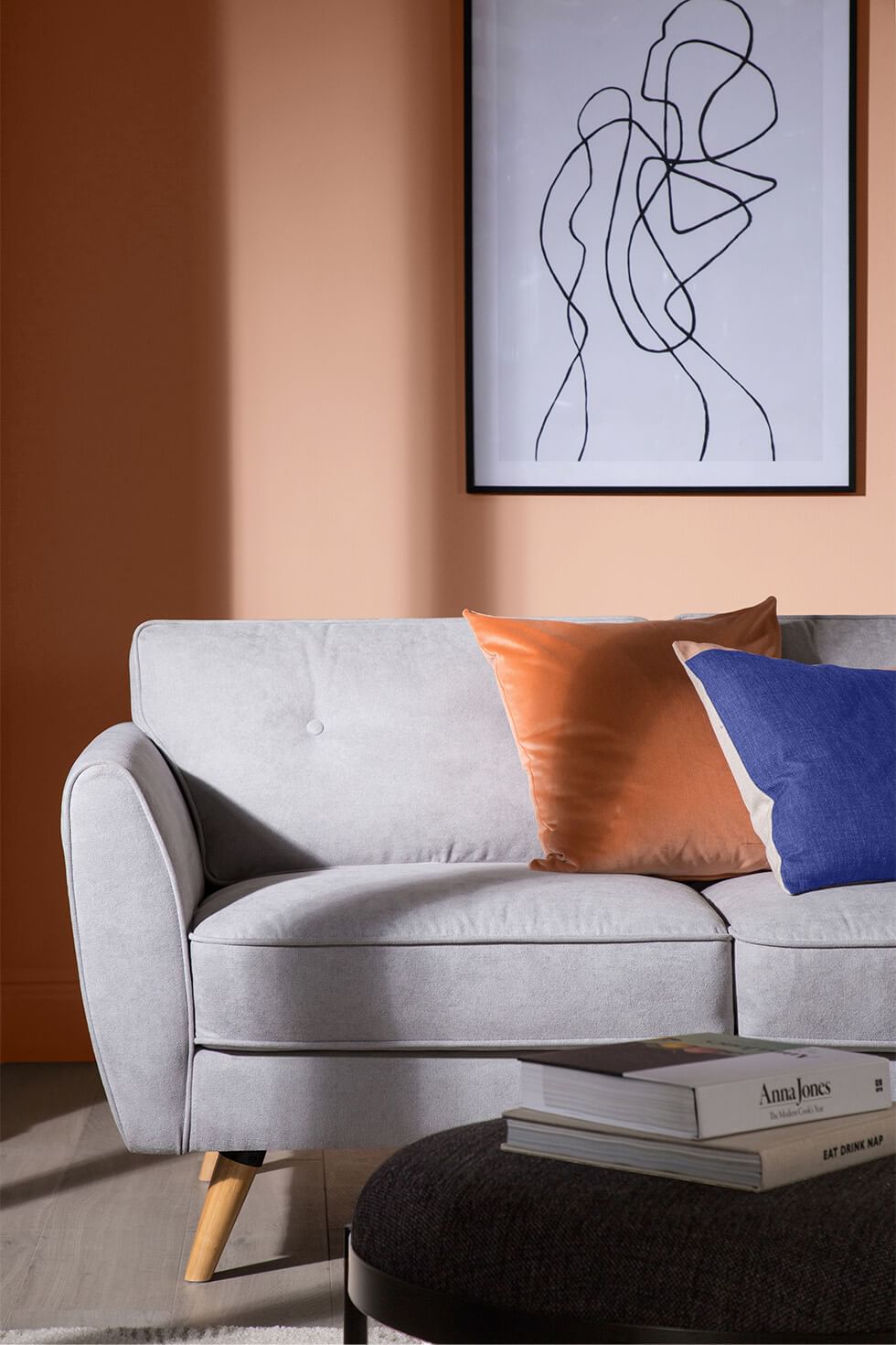
“Neutrals will always be timeless and sophisticated, whether they’re seen in fashion or interiors,” says Rebecca. “Capture this mood in your home with walls painted in Pantone 17-1230 Mocha Mousse, a milky chocolate brown.” This warm, earthy neutral is comforting and cosy, and doesn’t overwhelm the room with colour. Ground the space with a contemporary light grey sofa and use rich bold accents for a pop of colour. Liven up the space with throw cushions in Pantone 19-3954 Bluing and burnt orange.
4. Refresh with Grayed Jade

Seen on designer runways, green and its invigorating qualities have made its way into our homes. “Green reminds us of nature and is both inspiring and relaxing,” says Rebecca. “It’s perfect in rooms like the home office, where it helps to freshen up the space and promote focus, calm and productivity.” Paint the walls in creamy white and Pantone 14-6011 Grayed Jade for a bright and airy feel. Keep the overall scheme pared back, like pairing a simple white desk with a black chair. Work in black accents like wall frames and minimalist shelves for a smart, stylish look.


